The List Fields create a list of options that can be selected by a user, which can be generated in multiple different ways.
Depending on the list type selected, the list options can be set using:
- Manually defined, static values (List of Options Field)
- An existing concept, populating the list with the concept records (List of Concepts Field)
- A configuration list defined at the functionality level (List of Options (Multi-Use) Field)
- A TSQL target (List from Target Field)
- A TSQL target that filters the list based on the user’s input (List from Target (Dynamic) Field)
The appearance of list fields (excluding the List from Target (Dynamic)) can be customized to be displayed in different ways including dropdown menu, radio buttons, toggle switches, and chips.
The List from Target (Dynamic) displays a list of options in a drop down combo box that is loaded as the user types in the field.
List of Options
The List of Options Field allows the user to manually define their own list of options that do not require full instances elsewhere in the application.
Lists of Options are used for lists whose values are simple and static (do not change).

This Field can be displayed in various ways such as a dropdown menu, radio buttons, toggle switches, and chips.

List Options
These are the pre-populated options that will be displayed in the list.
List options will be displayed in sequential order. If no sequential order is specified or multiple options have been assigned the same sequence order, these options will be displayed in alphabetical order.
Sequence groups can also be created by assigning the same sequence number to multiple options, and letting the alphabetical sorting sort the options within the sequence groups.
List of Concepts
The List of Concepts Field generates a list of instances of a specific concept, allowing the user to select one or multiple options.

This Field can be displayed in various ways such as a dropdown menu, radio buttons, toggle switches, and chips.
List Concepts
Determines which concept will be used to generate the list of options. The concept records of the selected concept will be used as list options.
This list is then further filtered to only display the concepts which are visible from the form that the list is on.
Hierarchy Direction
Determines whether to start from the current instance (Form Instance), or from the workspace level (From Root) when selecting which instances to display.
Hierarchy Distance
Determines how deep the TSQL should search within the selected instance hierarchy for values. Set to 1 if starting at the workspace level.
Suppress Parent
Determines if the parent concept of the list options should be hidden (yes) or displayed (no).
If set to “No”, the options will be displayed as parent.child.

List of Options (Multi-Use)
The List of Options (Multi-Use) Field draws the list of available options from a configuration list defined at the functionality level. This type of list is used when needing to manually define a list of options that can be reused.

This Field can be displayed in various ways such as a dropdown menu, radio buttons, toggle switches, and chips.
Configuration List
Determines which Configuration List will be used to populate the list options. The options listed in this drop down menu are the list of available configuration lists defined at the functionality level.
To create a new configuration list, go to the functionality > Configuration tab > Configurations Lists table.
List from Target
The List from Target Field uses a TSQL stored procedure to generate the list of options. The field will display the values returned by the stored procedure as the list of options.

This Field can be displayed in various ways such as a dropdown menu, radio buttons, toggle switches, and chips.
Where Do We Get the Data for This Control?
Contains the target information of the target that will be called to get the list options.
List From Target (Dynamic)
The List from Target (Dynamic) field displays a list of options in a drop down combo box that is loaded as the user types in the field. The user’s input will be used in a target call to filter down the list of results, and display them in the combo box.
The list of options is generated using a TSQL stored procedure.

Where Do We Get the Data for This Control?
Contains the target information of the target that will be called to get the list options.
Add Jump Button
Determines if the jump button is displayed. This allows users to go directly to the selected instance.

If the list is on a wizard, the jump button will be suppressed regardless of the value selected.
Jump Button Text
Overrides the text on the jump button. This should be a short phrase that clearly states what will happen when the user clicks the button. If this field is left blank, the default button text will be “GoTo”.
Open Jump Instance in Popup
Determines if the instance opens in a popup window (Yes), or on the whole page (No).
Display Type
All lists (with the exception of the List from Target (Dynamic)) can be configured in any of the formats below.
Drop Down Combobox
A simple dropdown menu allowing the user to select one option. A Jump Button can be enabled to allow the user to go directly to the record that is selected.

Add Jump Button
Determines if the jump button is displayed. This allows users to go directly to the selected instance.

If the list is on a wizard, the jump button will be suppressed regardless of the value selected.
Jump Button Text
Overrides the text on the jump button. This should be a short phrase that clearly states what will happen when the user clicks the button. If this field is left blank, the default button text will be “GoTo”.
Open Jump Instance in Popup
Determines if the instance opens in a popup window (Yes), or on the whole page (No).
Multi Select
A dropdown menu allowing the user to select one or more options.

Multi Select Chips
Chips, allowing the user to select one or more options.

Chip Fill Mode
Determines if the chips are filled (Solid) or only have a border outline (Outline).

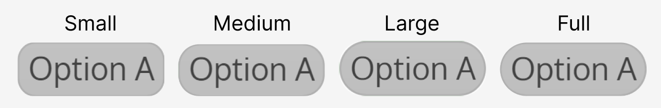
Chip Roundness
Determines the border radius of the chips.
Multi Select Switches
Toggle switches allowing the user to select one or more options.

Single Select
Radio buttons, allowing the user to select one option.

Single Select Layout
Determines if the list layout is horizontal or vertical.

Single Select Chips
Chips, allowing the user to select one option.

The chip fill mode and roundness can be customized (see “Multi Select Chips”).