The Signatures Fields are used to collect a signature from a user.
The signatures can either be signed digitally by hand (Signature Field) or by the press of a button (SignedByOn Field).
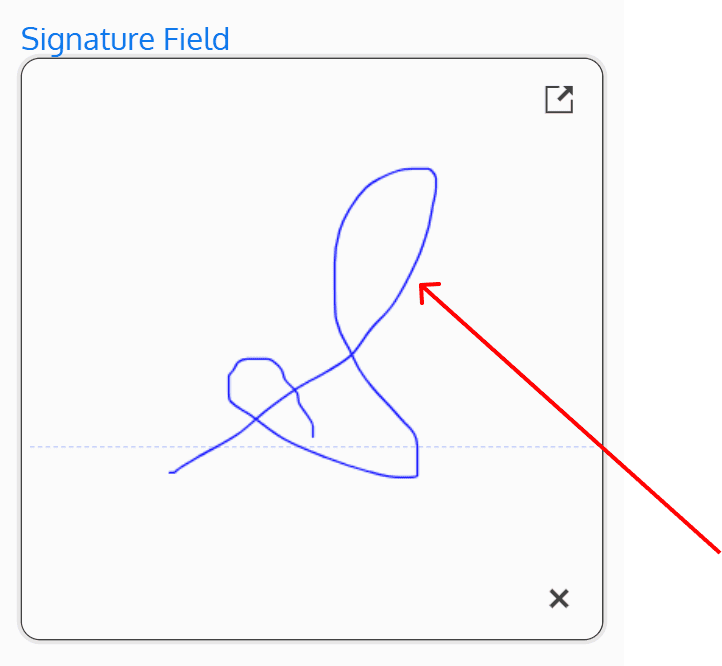
Both signature types have the ability to be cleared if signed by mistake – the Signature Field provides an “x” button to erase the signature, and the SignedByOn Field provides an “Unsign” button to unsign.
Both signature fields can also be made mandatory, meaning the user must provide a signature before being able to save the form.
Signature
The Signature Field is used to have a user sign the instance and have the signature date, user who signed, and the signature itself saved. If signed by mistake, the field provides an “x” button to erase the signature. The signature can be made mandatory, meaning the user must provide a signature before being able to save the form.
The field also includes a button that allows users to zoom in on the signature field. Clicking this button opens a popup window with an enlarged view of the signature field, retaining all the same features.
The signature field’s height, width, stroke width, color, background color, and guidelines can all be customized.

Height (px)
Specifies the height of the signature field in pixels. A minimum height of 100px is recommended to provide sufficient space for signing.
Width (px)
Specifies the width of the signature field in pixels. A minimum width of 200px for initials and 300px for a full name is recommended to provide sufficient space for signing.
Stroke Width (px)
Specifies the width of the digital signature pen in pixels.
A value of 1 will create the appearance of a fine pen, and a value of 5 will create the appearance of a thick pen.

Signature Color
Specified the signature pen color.
Any valid CSS, HEX, or RGB value is accepted.
For example, to set the colour to blue, “blue”, “#0000FF”, or “rgb(0, 0, 225)” can be used.

Background Color
Specifies the background color behind the signature.
Any valid CSS, HEX, or RGB value is accepted.
For example, to set the colour to blue, “blue”, “#0000FF”, or “rgb(0, 0, 225)” can be used.

Hide Guide Line
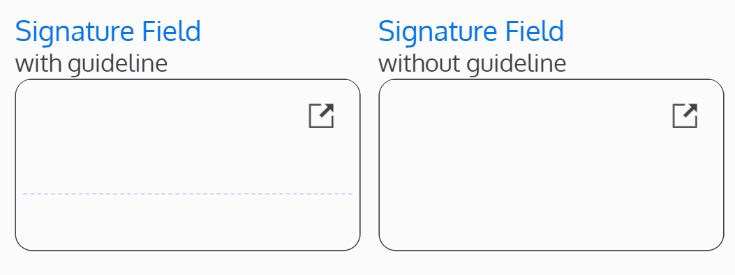
Determines if there will be a guide line on the signature field. The guide line is a dotted, fine, horizontal line, that provides guidance to the user on where to sign.
If set to “No”, the guide line will not be hidden, and will be displayed.
If set to “Yes”, the guide line will be hidden.

SignedByOn
The SignedByOn Field is used to have a user digitally sign the instance by clicking a button. The signature can be made mandatory, meaning the user must provide a signature before being able to save the form.
Upon page load, this field display a “Sign” button. Once the user clicks the button, their name (Signed By) and the current date (Signed On) will be displayed.
Optionally, an “Unsign” button can be configured to be displayed once the user has clicked the “Sign” button. The “Unsign” button reverts the action of clicking the “Sign” button by erasing the signature and date.

Allow Unsign Button
Determines if an “Unsign” button will be displayed once the user has signed.
If set to “Yes”, an “Unsign” button will be displayed once the user has signed, allowing the user to erase their signature.
If set to “No”, the “Unsign” button will not be displayed.
