The String Field is used to collect a string user input and save the user input to the database.
By default, the String Field allows the user to enter and submit any input to the database; no additional configurations are required. However, the String Field can be configured in various ways to enforce a custom format.
The field can be configured as a single line, or set to expand with the text. A character limitation can be added on the field by specifying the maximum number of characters allowed.
Masks can be used to enforce a specific string format. For example: a phone number field can be configured by setting a Mask of “+0 (000) 000-0000” (more information on Masks below). This will enforce the user input to be in the format of a phone number, and only allowing 0-9 as an input for each character.
In addition to the mask, a regular expression of the same format can be set on the Field for additional security. The user input is validated against the regular expression upon submission attempt and will only be saved to the database if it matches the specified format.
The String Field can be configured to display SMS, email, and/or call buttons that trigger actions based on the input. This enables the user to instantly send a text message, email, or make a call to the phone number or email address entered in the field.
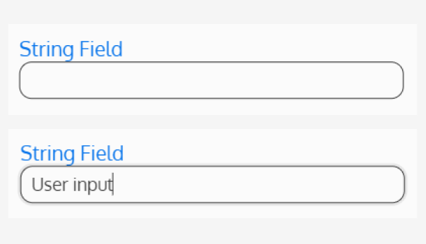
String Type
Should this string be a single string field or a multiline string field?
The single string field has a fixed height of one line, regardless of the length of the user’s input. If the input exceeds the width of the field, only a portion of the text will be visible to the user. This string type is recommended for inputs with short, predictable entries, such as a name or phone number.
The multiline string field expands as text is entered, automatically adjusting to display the entire content. This string type is ideal for longer entries, such as a comment or feedback section.

Maximum Length
Should the string be restricted to a maximum number of characters? Enter the maximum number of characters that a user is allowed it enter in this field. If the user tries to submit a value that is longer than the maximum length specified, the form submission will fail, and they will receive an error message informing them of the maximum number of character allowed.
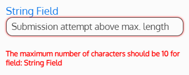
Since there is no message informing the user of the maximum character length prior to a failed submission, it is recommended to inform the user of the maximum character length using one of the description fields.
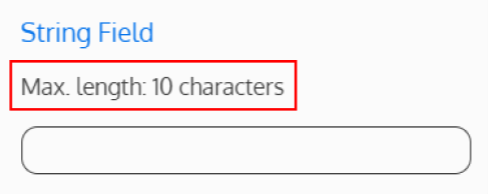
A mask (see below) can also be used to help the user enter data in the expected format.
If no value is entered, the user can submit a value of unlimited character length.
Mask
A mask is a sequence of characters used to display data in a specific format. This helps the user know what type of data is expected in the field, and validates the data format prior to submission.
Masks must be built using the following rules.
| Mask Character | Required User Input |
| 0 | Digit (0-9) |
| 9 | Digit (0-9) or space |
| # | Digit (0-9), space, plus (+) and minus (-) signs |
| L | Letter (a-Z) |
| ? | Letter (a-Z) or space |
| A | Alphanumeric (0-9, a-Z) |
| a | Alphanumeric (0-9, a-Z) or space |
| & | Character (excluding space) |
| C | Character or space |
For example: if “0” is entered in the Mask Field, the user will only be allowed to enter one digit from 0-9. If they try to enter any other characters, it will not work.

Additional characters can be placed within the mask to force particular character(s). For example: if “+0 (000) 000-0000” is entered in the Mask Field, the “+”, “(“, “)”, and “-” are permanent values that do not change; the user will only be prompted to enter values where the “0”s are.

If no value is entered, no Mask will be applied to the Field.
Note: If both a Maximum Length and Mask are defined, the Maximum Length MUST be high enough to include all characters specified by the Mask, otherwise the user will receive an error.
Regular Expression
A regular expression (or a regex) is a series of characters that specifies a match pattern within a string. If a regular expression is entered in this field, it will be used to check for a pattern match in the string the user submits. If the pattern matches successfully, the form submission will succeed. If the pattern does not match, the form submission will fail.
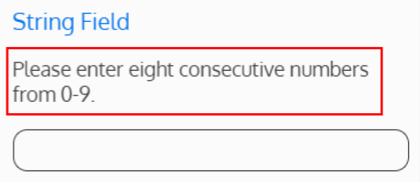
For example to ensure the user input is eight characters long and each character is from 0-9, the regular expression ^[0-9]{8}$ should be used.
Since there is no message informing the user of the regular expression prior to a failed submission, it is recommended to inform the user of the expected input format using one of the description fields. A mask (see above) can also be used to help the user enter data in the expected format.
If no value is entered, no regular expression will be applied to the Field.
Note: Do not include slashes (“/”) in the regular expression.
Regular Expression Error Message
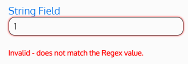
If the regular expression pattern does not match the user’s input, what error message should be displayed to the user? If no text is entered, the user will receive a generic error message upon the failure of the form submission.
Enable SMS Button
Determines if a button to send SMS will appear on the field when a mobile number value is entered. This button is used to send SMS messages to a mobile number entered in the field.

If “Yes” is selected, an SMS Message Queue must also be selected.
Send SMS Button Icon
Only applicable when “Enable SMS Button” is set to “Yes”.
Overrides the icon on the button to send SMS.
For example, if using Font Awesome’s light mobile icon, fa-light fa-mobile would be entered in this Field.
SMS Message Queue
Only applicable when “Enable SMS Button” is set to “Yes”.
Determines which message queue should be used to process the SMS message. This field is required for the SMS functionality to work.
Enable Send Email Button
Determines if a button to send an email will appear on the field when an email address is entered. This button is used to send an email to an email address entered in the field.

Send Email Button Icon
Only applicable when “Enable Send Email Button” is set to “Yes”.
Overrides the icon on the button to send an email.
For example, if using Font Awesome’s light envelope icon, fa-light fa-envelope would be entered in this field.
Enable Call Number Button
Determines if a button to call will appear on the field when a phone number value is entered. This button is used to call a phone number entered in the field.
Note: This button will only be displayed if “Enable Call Number Buttons” is set to “Yes”, a phone number value is entered in the field, and using the MAUI application.
Call Number Button Icon
Only applicable when “Enable Call Number Buttons” is set to “Yes”.
Overrides the icon on the button to call the phone number.
For example, if using Font Awesome’s light phone icon, fa-light fa-phone would be entered in this field.