Field Definitions are the elements that make up the content on a Form. They define what types of elements that go on the Form, their position, their restrictions, and other configurations specific to each Field type.
Basic Tab
The Basic tab is where the field’s general settings and field type configurations are managed.
The general field configurations are the configurable fields on a field that are not unique to a particular field type. The general fields are consistently applied across all field types, with specific exceptions tailored to the requirements of each particular field type.
Define The Field Label & Purpose
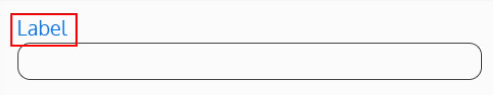
Label
Each Field Definition requires a label. Use this label to assign a unique name to the Field Definition, making it easy to identify in the list of the Form’s Field Definitions.
Display Label
Optionally, there is an option to display the label above the Field. Select “Yes” under Display Label to show the label, or select “No” to keep the label hidden and used for identification purposes only.
Purpose
What is the purpose of this Field being defined on the Form? This will be used as part of the internal documentation to further describe the Field.
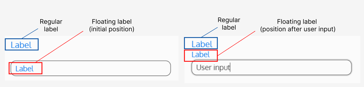
Floating Label (only applicable to DateTime, Numeric, and String Field types)
There is also the option to display the label as a floating label – this is a label that is initially displayed in the input Field, and “floats” to the top of the input Field upon user input.
Choose The Field Type
Field Type
What type of Field will this Field Definition be?
See the Fields category for information about each field type.
Set The Data Configurations
XML Element Name
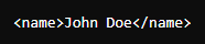
What is this Field’s XML Element Name? The XML Element Name allows the data to be saved, and is used to reference the Field in TSQL and Childlist column definitions.
For example: if this Field is intended to collect a customer’s name, the XML element name could be “Name”.
Note: Any XML elements defined under Form Definition > Overview > Build Instance Name, must have exact matching names to link the data.
Default Value
What value should already be pre-populated in the Field?
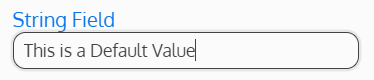
The user is able to edit this value – it is commonly used as a suggested value to the user.
Note: This will replace the Empty Message (if configured). If the user clears the Default Value, the Empty Message will then be visible.
Default Value(s)
What value(s) should already be pre-selected? Enter the name(s) of the option(s) that should already be selected when the user lands on the page. These values MUST be exact matches to the option names, and are case sensitive. If entering multiple values, separate with only a comma (no spaces).
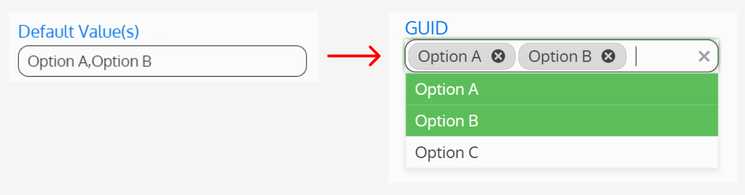
The user is able to edit this selection – this is commonly used as a suggestion to the user.
Note: This will replace the Placeholder Text (if configured). If the user clears the Default Option(s), the Placeholder Text will then be visible.
Data Field Required
Is this Field mandatory? If “Yes” is selected, the user won’t be able to submit the Form if this Field is left blank. A red asterisk will also appear on the Field, indicating to the user that the Field is mandatory.
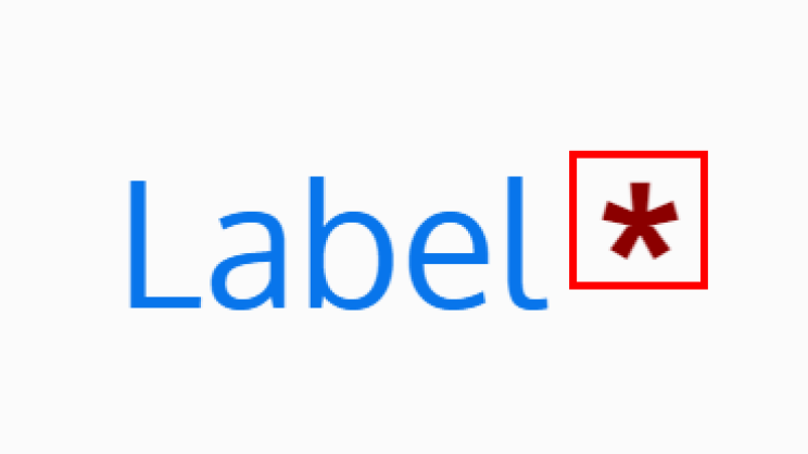
The asterisk’s position can be configured under the Styling Tab.
If “No” is selected, the user will be allowed to submit the Form even if this Field is left blank.
Auto Postback
Should the page auto save and reload when the Field is updated? This is useful for cases where the page content has conditional filters based on user input in this Field.
Position The Field
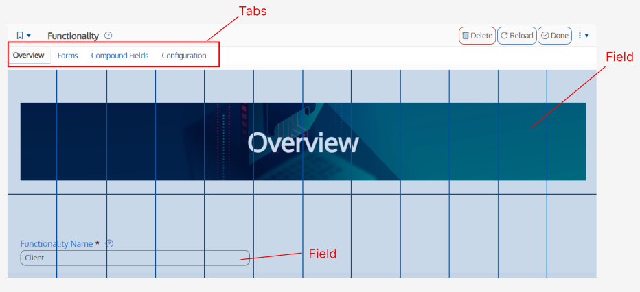
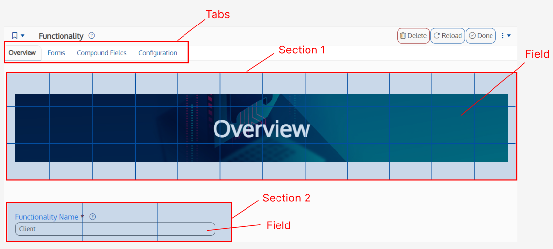
Each Field Definition is positioned on a Tab. Depending on the Tab’s layout (specified under Form Definition > Overview > Tabs > Tab > Tab Layout), the Field Definition(s) might be positioned on a grid directly on the Tab, or a section grid.
Grid Layout Example
By default, a grid layout will have 12 columns, and an unlimited number of rows can be defined. If a different number of columns was specified for the Tab (under Form Definition > Overview > Tabs > Tab > Tab Layout), the grid will have the specified number of columns.
Section Layout Example
By default, each section will have a grid of 12 columns, where an unlimited number of rows can be defined. If a different number of columns was specified for the section (under Form Definition > Overview > Tabs > Tab > Tab Layout > Section Definition), the grid will have the specified number of columns.
Tab
Each Field Definition is assigned a Tab to be positioned on. These Tab numbers are defined on the Form Definition > Overview. Indicate the Tab the Field Definition should appear on.
Note: If the Field Definition is the only Field on the page and it is not visible to certain users due to a Conditional Filter, the Tab won’t be visible either.
Section
Each Tab has the option of being configured as a grid layout or a section layout. This configuration is defined on Form Definition > Overview > Tabs > Tab > Tab Layout. If the Tab’s layout is a section layout, indicate the section the Field Definition should appear on.
Note: If the Tab was configured as a grid layout, leave the Section Field empty.
Grid Row
This is the grid row on the Tab (or section) which the Field Definition will start on.
Grid Row Span
This is the number of rows the Field will span across.
Note: If no value is entered, the Grid Row Span defaults to 1.
Grid Column
This is the grid column on the Tab (or section) which the Field Definition will start on.
Grid Column Span
This is the number of columns the Field will span across.
Note: If no value is entered, the Grid Column Span defaults to 1.
Layer
This is the layering order of Fields that is used if multiple Fields overlap on one another. Layers are defined from 0 to 99. The higher the layer number, the higher the Field will appear over other Fields.
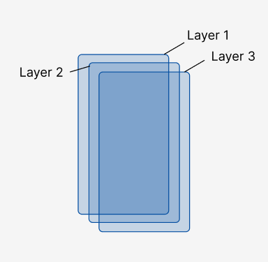
Note: If no value is entered, the Layer defaults to 10.
Set The Field Restrictions (Optional)
Restrict Visibility by Condition
Include any Conditions that should change whether or not this Field should be displayed. These may be based on any of the Fields on this Form, the State of the record, the role(s) of the user, or some other custom action.
If Conditions are specified, a user will be able to see the Field if any of the Conditions are met. To specify multiple Conditions that must be met in order enable visibility, create a Condition that encompasses all necessary criteria and add it to this Field.
The list of possible Conditions is maintained at the Form level under the Security Tab.
Restrict Edit by Condition (Only Applicable to Certain Field Types)
Include any Conditions that should change whether or not this Field should be editable. These may be based on any of the Fields on this Form, the State of the record, the role(s) of the user, or some other custom action.
If Conditions are specified, a user will be able to edit the Field if any of the Conditions are met. To specify multiple Conditions that must be met in order enable editability, create a Condition that encompasses all necessary criteria and add it to this Field.
The list of possible Conditions is maintained at the Form level under the Security Tab.
Which Platforms Can See This Field?
If a Field is not intended for a specific platform or is not configured to display correctly on it, you can specify the platforms on which it should be displayed here. If no platforms are selected, the Field will be displayed on all platforms.
Which Orientations Can See This Field?
If a Field is not intended for a specific orientation or is not configured to display correctly on it, you can specify the orientation on which it should be displayed here. If no orientation is selected, the Field will be displayed in both portrait and landscape.
Set The User Guidance (Optional)
Use the Fields below to add an optional description above of below the Field, placeholder text, and/or a tool tip. These Fields are most commonly used to provide instructions to the user on the Field’s purpose and how it should be used.
Description Above Field
The Description Above Field is inserted below the label (if it exists) and above the Field.
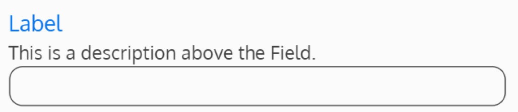
The description box treats the text as code, meaning that HTML tags can be used to format and markup the text, and to add CSS classes to elements.
Description Below Field
The Description Below Field is inserted below the Field (if it exists).
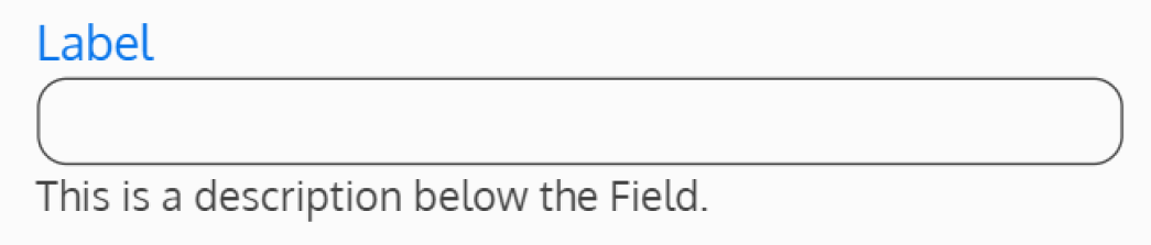
The description box treats the text as code, meaning that HTML tags can be used to format and markup the text, and to add CSS classes to elements.
Tool Tip
A Tool Tip is a message that appears when the user hovers over the Field.
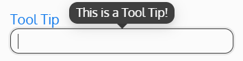
The text entered in this Field will appear as a Tool Tip. If the Field is left blank, there will not be a Tool Tip for this Field.
Empty Message
What message should be displayed when the Field is empty? This is the placeholder text shown until the user enters an input.
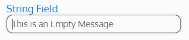
If the Field is left blank, there won’t be an empty message.
Help Content Tab
The help content tab contains a help content field, when populated a help icon will be displayed and when selected will display a popup window with the content you enter inside it. This gives you a way to provide additional details on how to use a field without cluttering the user experience with long descriptions.
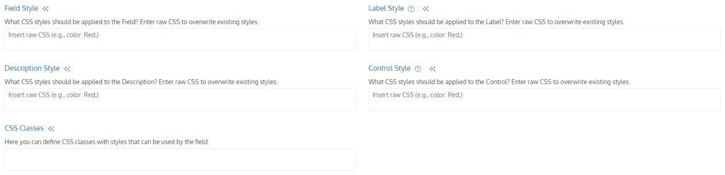
Styling Tab
The styling tabs contains the following fields:
- Field Style
- Label Style
- Description Style
- Control Style
- CSS Classes
These fields allow you to enter raw CSS to apply styling to specific area of the field. Styles applied here will take priority over any theme or stylesheets being used.
The CSS Classes field is expected to contain CSS classes that have styles in them. These classes will be made available for the field to use.
To learn more about applying styling to fields, see Styling Form Definitions.
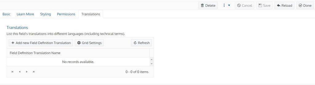
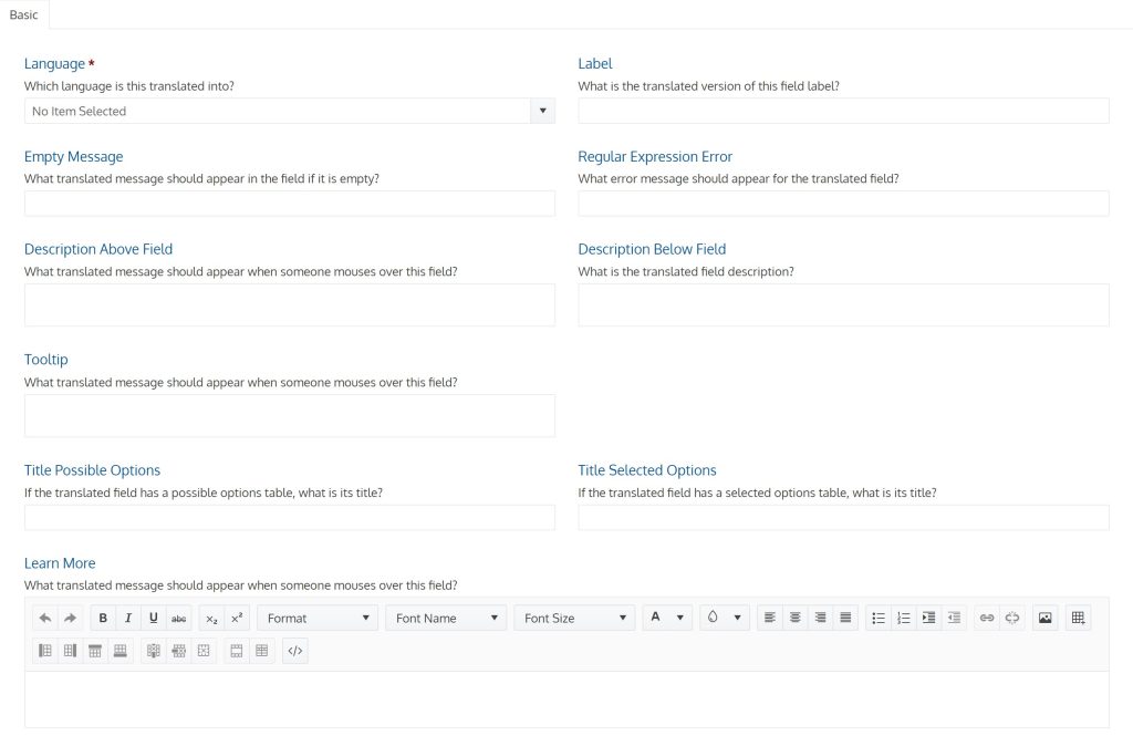
Translations Tab
This tab allows you to add language translations for the field.
This is what a new translation will look like:
Example Video
Previous article: Adding Dictionaries to your Functionality
Next article: Changing User Experience Permissions