The Panel Bar Field allows you to create a collapsible accordion structure that contains sections with expandable children sections, allowing users to expand and collapse sections, and click on an instance to view its content. Specifically, it is designed to display Instances data with the parent-child relationship between instances. The data for panel bar is returned from a target call.
The panel bar has two types of layout, Basic and Advanced. The Basic layout displays the default panel bar design, and the Advanced layout displays the content using custom HTML and styling. The Advanced layout offers the option to display each item’s content either within a collapsible accordion or directly in the header, ensuring it is always visible.
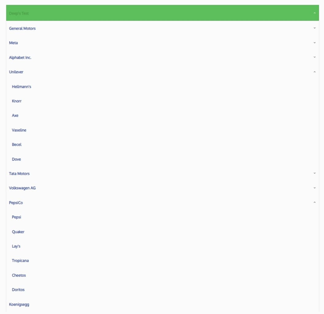
Here is an example of basic PanelBar Layout.

Here is an example of Panel Bar Advanced layout using Content as Header mode.
Here is an example of Panel Bar Advanced layout using Content for Children mode.

Where Do We Get the Data for This Control?
Contains the target information of the target that will be called to get the data that will be displayed in the panel bar.
If using a Basic layout, the target should return the following columns: InstanceGUID, InstanceName and ParentGUID.
If using an Advanced layout, the target should return the following columns: InstanceGUID, InstanceName, ParentGUID and Content.
The InstanceName string values are used to create the accordion nodes.
The InstanceGUID and ParentGUID of an item must always be different.
The content returned in the content column should be raw HTML/CSS. This specifies how the panel bar items are structured and styled.
Note: To ensure the panel bar is displayed correctly, the target must return at least one root node. A root node is an item with no parent (in this case, the item’s Parent GUID should be “00000000-0000-0000-0000-000000000000”) or an item whose parent is not present in the data (the parent does not exist as a sperate item in the dataset). The GI_ListInstancesForPanelBar stored procedure can be used to test Basic panel bar Layout.
Panel Bar Type
Determines the type of layout that the panel bar will use.
The panel bar has two types of layout, Basic and Advanced. The Basic layout displays the default panel design, and the Advanced layout uses custom HTML and styling for full control of the rendered design.
Note: If using the Advanced layout, an additional content column must be returned by the target.
Here is an example of the basic PanelBar Layout.
Here is an example of the advanced PanelBar layout.
Advanced PanelBar Content Mode
Only applicable when “Panel Bar Type” is set to “Advanced”.
Determines how the advanced target call content will be used within the PanelBar.
The “Content as Header” option displays a panel’s content directly within the header, ensuring it is always visible rather than collapsible.
The “Content for Children” option displays content in a collapsible accordion beneath the panel header. Users can toggle between a collapsed state, showing only the header, and an expanded state, revealing the content below the header.
Allow Instance Navigation
Determines if an accordion node can be clicked to navigate to the node’s instance window.
If set to “Yes”, users will be able to click on accordion nodes, and a window will popup displaying the instance’s content.
If set to “No”, users won’t be able to click on accordion nodes to view the instances. They will, however, still be able to navigate the accordion hierarchy.
