Form definition-level styling is used to apply custom styling to a specific form, ensuring it has a unique appearance. For global styling options, see the Styling Options in trellispark article.
Creating CSS Classes
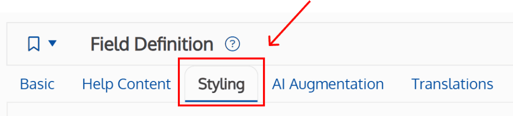
Custom CSS classes at the form level are configured on the form’s styling tab.
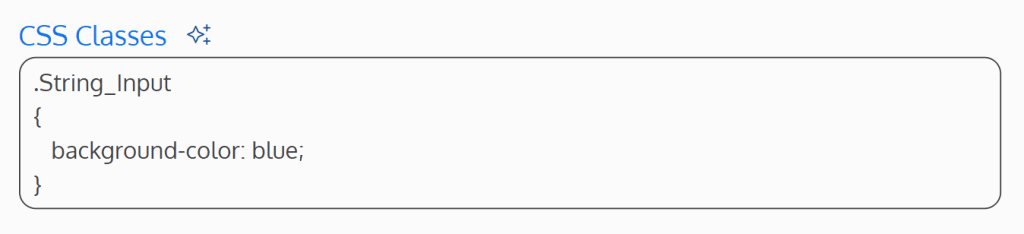
The CSS Classes field is where CSS classes and styling properties can be added to add to the form.

The CSS Classes field is treated as a CSS stylesheet, meaning raw CSS code should be entered.
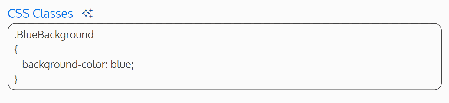
AI can also be used to generate CSS style properties by clicking on the sparkles icon.

Applying CSS Classes
Once CSS classes have been defined under the styling tab, they must be applied to fields on the form. There are two areas where CSS classes can be added to a field on a form: the field descriptions and the field component itself. The Readonly Content field also allows for an additional area of styling.
Field Descriptions
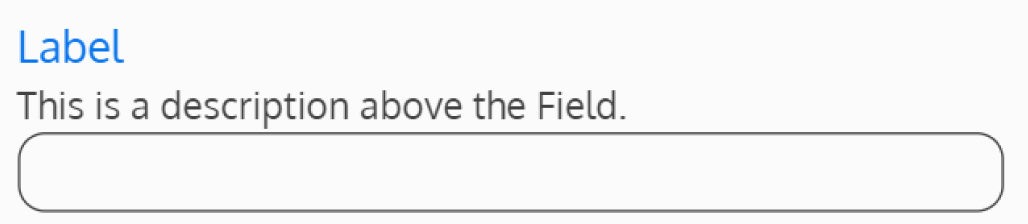
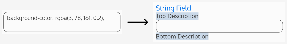
Each field definition contains two fields where a top and bottom description can be added to the field.

When content is entered in the Description Above Field field, the content is inserted below the label (if it exists) and above the Field.
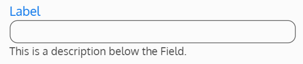
When content is entered in the Description Below Field field, the content is inserted below the Field.
The Description Above Field and Description Below Field fields treat content as raw HTML, meaning HTML tags and CSS classes can be added directly in these fields. To apply a CSS class to one of the description fields, define the desired HTML element where the styling should be applied, and add the CSS class to the element.

Field Component
Depending on the field type, CSS classes can be applied to different parts of the field. To view the available areas for styling, navigate to the field definition’s styling tab, and scroll to the bottom of the page to the CSS Classes information accordion.
Note: CSS applied to fields will override any conflicting styles at the form level, app.css, and in the Telerik theme.

Inside this article will be all the available CSS classes that have already been added to different parts of the field component by default.
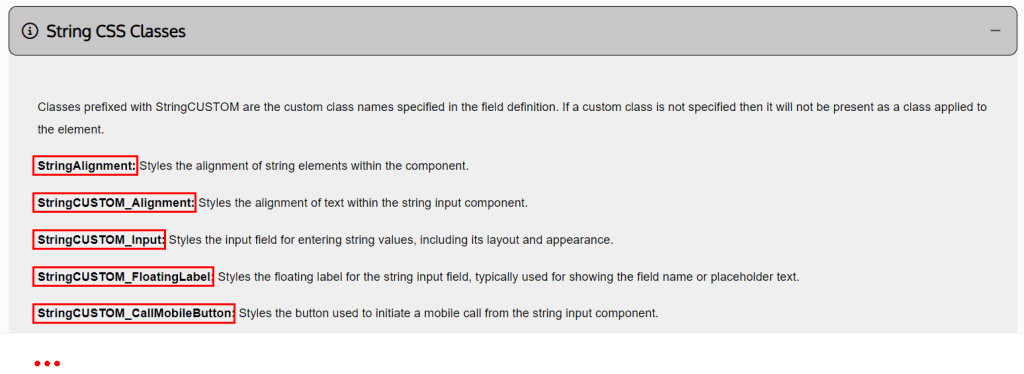
There are two ways to add CSS styling to these specific parts of the field component.
Common Styling for Multiple Fields
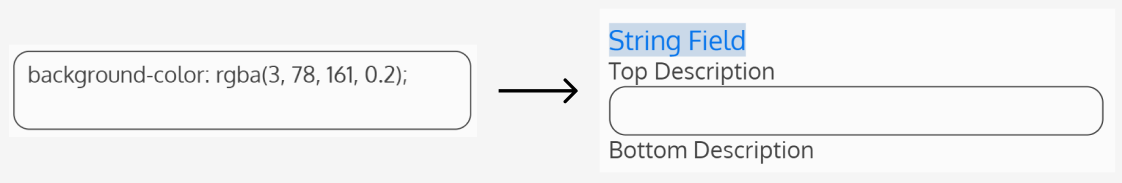
To add common styling, meaning the style(s) will be applied to all fields that contain the specific component on the form, use the class name as it is, removing “CUSTOM”.
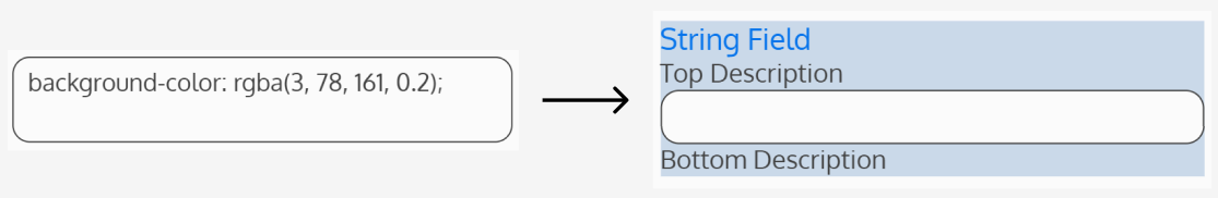
For example, if wanting to target the string field’s input field where the class is StringCUSTOM_Input, use String_Input as the CSS class. This CSS class can then be added to the form’s CSS Classes field to target all the string input fields on the form.

Custom Styling for Selected Fields Only
Custom CSS Class Names
To add styling to selected fields only, enter a unique CSS class name in the Custom CSS Class Name field, under the field’s styling tab.

Then, use the class name for the specific part of the component to target, replacing “CUSTOM” with the custom CSS class name.
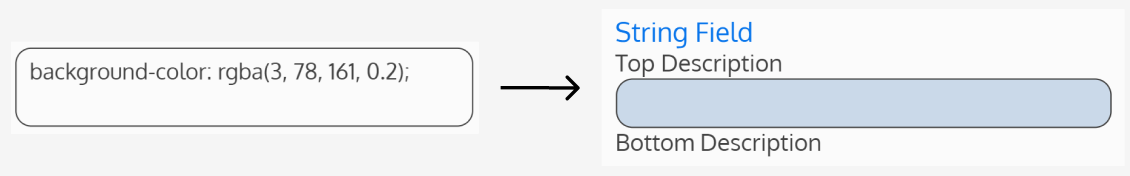
In the example above, if wanting to target the string field’s input field where the class is StringCUSTOM_Input, use StringBlueBg_Input as the CSS class. This CSS class can then be added to the form’s CSS Classes field to target only that specific string’s input field.


To apply the same style to other fields, add the same custom CSS class name (in this example, “BlueBg”) to the field’s Custom CSS Class Name field. That field will then also take on the same styling defined.
Note: It is recommended to use unique CSS class names to avoid overwriting any pre-existing classes essential for the default layout. Overriding an existing class within the project may cause issues with the default page configuration.
Basic Styling
Basic styling can also be applied to a field to only affect that specific field’s styling. Basic styling can be accessed at the top of a field definition’s styling tab.
Basic styling for the Field, Label, Descriptions, and Control can be configured by entering CSS properties and values in the basic styling fields. CSS entered in these fields will override the default styling for that particular field.
Field Style
Applies to the Field container.
Label Style
Applies to Field Label.
Description Style
Applies to both the Top and Bottom Field Descriptions.
Control Style
Applies to the Field’s Control element.
See “Custom CSS Class Names” above for more targeted styling on the Field’s Control.
Note: Certain Field Definitions do not support basic styling on the Control. Here is the list of Fields that don’t support basic styling on the Control: Barcode, Chart, ChildList, Dictionary, Document, Frequency, Gauge, PowerBI, QRCode, ReadOnlyField, ReadOnlyText, Report, Scheduler, Select Item. Any CSS added to the Control Style Field for these types of Fields will be ignored. See “Advanced Styling” below for more options on styling these Fields’ controls.
Basic position adjustments can be made for the Red Asterisk, AI Enhance, and Help Content Button. They can be positioned to the left or right of the Label, Field Content, Bottom Description, or Top Description.
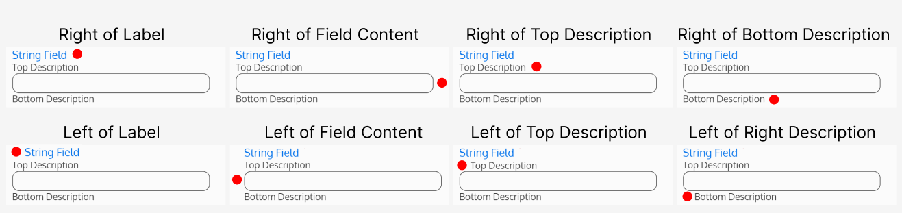
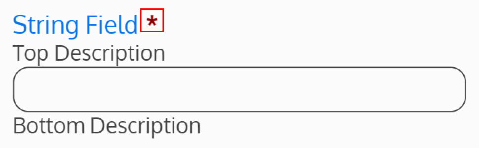
Red Asterisk Position
If the Field had been made required, a red asterisk will be displayed. Where should the red asterisk be positioned, if visible?
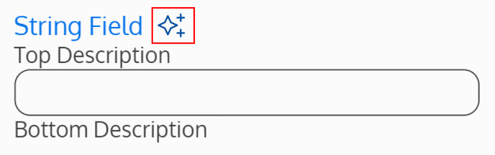
AI Enhance Position
If AI Enhance has been turned on for the Field, sparkles will be displayed. Where should the sparkles be positioned, if visible?
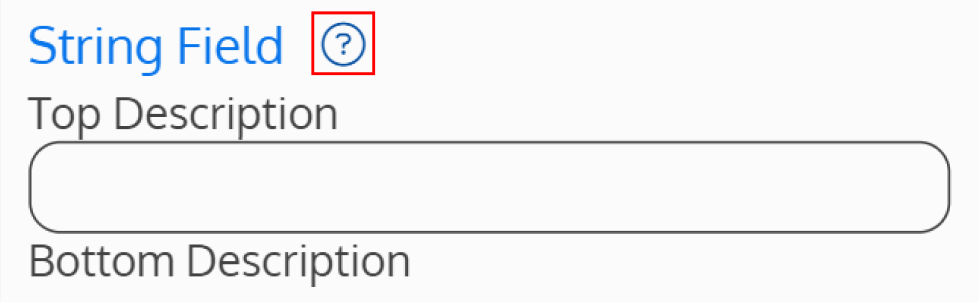
Help Content Button Position
If Help Content has been added on the Help Content Tab, a help button will be displayed. Where should the help button be positioned, if visible?
Readonly Content Field
The Readonly Content Field is a unique field in the sense where it allows users to create HTML/CSS content on the form.