The card component is used to display data returned from a target in a card layout. Cards can be laid out horizontally or vertically and use the basic or advanced layout. The basic layout is a generic predefined layout where the data provided automatically slots in. The advanced layout allows you to fully customize the appearance of the card using your own HTML and CSS styles.
The card field also supports search components. Refer to the Search Components article for more information.
Basic Layout
All targets for cards using the basic layout must return at a minimum, the following columns:
- InstanceGUID
- This field is optional but is required if the Open Instance or Open Instance In Window buttons are enabled. This field should contain the InstanceGUID of the instance.
- Hierarchy
- This field is optional but is required if the Open Instance In Window button is enabled. This field should contain the Hierarchy of the instance.
- Header
- Contains the content for the header of the card. The content will be displayed and styled as a title.
- BodyTitle
- The content will be displayed and styled as a title in the body area of the card. This field is optional.
- BodySubTitle
- The content will be displayed and styled as a sub-title in the body area of the card just below the BodyTitle. This field is optional
- Body
- Contains the content for the body of the card. The content is displayed below the BodyTitle and BodySubTitle. The content can be raw HTML or plaintext, no default styling is applied. This field is optional.
- Footer
- Contains the content for the footer of the card. The content can be raw HTML or plaintext, no default styling is applied. This field is optional.
- ImageURL
- Contains the URL for an image that will be displayed in the card. This field is optional.
Fields that are unused should return empty strings.
IMPORTANT NOTE: If your cards have the Instance Actions enabled it’s highly recommended to also return the InstanceStatus column too. Otherwise you could have a situation where you execute an event that changes the state but because the state isn’t returned from the target, the data is the same and doesn’t refresh. If the InstanceStatus was returned then the new value would be picked up and the cards would be refreshed.
Advanced Layout
All targets for cards using the Advanced layout must return at a minimum, the following columns:
- InstanceGUID
- This field is optional but is required if the Open Instance or Open Instance In Window buttons are enabled. This field should contain the InstanceGUID of the instance.
- Hierarchy
- This field is optional but is required if the Open Instance In Window button is enabled. This field should contain the Hierarchy of the instance.
All additional columns must be specified in the field definition in the Card Keys field, the only exception to this is the InstanceStatus (See important note below). The data returned will be slotted into the HTML (also specified in the field definition) for the card in the correct place. If there are any typos in the Card Keys or column names, data will not be populated into the cards correctly.
IMPORTANT NOTE: If your cards have the Instance Actions enabled it’s highly recommended to also return the InstanceStatus column too. Otherwise you could have a situation where you execute an event that changes the state but because the state isn’t returned from the target, the data is the same and doesn’t refresh. If the InstanceStatus was returned then the new value would be picked up and the cards would be refreshed.
Card Layouts
Cards have two layouts, basic and advanced. Find more details regarding them below.
Basic
The basic layout is a predefined generic layout that’s intended to slot the data returned from the target into a specific location.
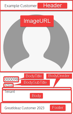
Above is an example of the basic layout and where the data is positioned.
It’s important to note that even in the basic layout you can apply raw HTML for the Header, Body, and Footer fields however plain text can also be supplied as some basic styles are automatically applied.
Below is HTML generated for the example card above to give a better understanding of where the fields from the target slot in.
<!--Orientation of the card is applied as a class and the width specified in the field definition is applied-->
<div class="k-card telerik-blazor k-card-vertical" style="width: 300px">
    <div class="k-card-header ">
        <!--The content for the Header is rendered inside a title div. This field is optional-->
        <div class="k-card-title ">Example Customer</div>
    </div>

    <!--If the ImageURL field from the target has a value it will go in the src attribute of the img tag. This field is optional-->
    <img class="k-card-image " src="https://villagesonmacarthur.com/wp-content/uploads/2020/12/Blank-Avatar.png" style=" ">

    <div class="k-card-body ">
        <!--The content for the BodyTitle is rendered inside a title div. This field is optional-->
        <div class="k-card-title ">000098</div>

        <!--The content for the BodySubTitle is rendered inside a subtitle div. This field is optional-->
        <div class="k-card-subtitle ">Active</div>

        <!--If the body seperator is enabled in the field definition this div will be rendered-->
        <div class="k-card-separator k-separator-horizontal "></div>

        <!--The content for the Body is rendered here within the body div. This field is optional-->
        Tenant
    </div>

    <!--The content for the footer is rendered inside the footer div. This field is optional-->
    <div class="k-card-footer ">
        GreatIdeaz Customer 2023
    </div>
</div>
Advanced
The advanced layout is a fully customizable layout. The data from the target is expected to contain the data to populate the HTML. The HTML itself is expected to be specified in the field definition along with the Card Keys that map to the columns returned from the target.
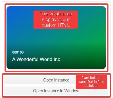
The advanced layout allows you to completely customize the card outside of the Instance Action buttons. The full card HTML should be specified in the field definition, instance action button will be rendered below the custom card HTML.
It’s expected that the HTML contains the values specified in the Card Keys field, so the data returned from the target can be applied in the correct places. For example if one of your Card Keys is CustomerName, then in the HTML put {CustomerName} in all the places the customer name should appear, then ensure the target returns a column called CustomerName the value returned will be what’s displayed on the card.
The Example HTML used for the card pictured above can be viewed below:
<div style="width: 350px;height: 220px;border-radius: 12px;overflow: hidden;position: relative;box-shadow: 0 1px 3px rgba(0, 0, 0, 0.12), 0 1px 2px rgba(0, 0, 0, 0.24);">
    <div style="width: 100%;position: absolute;padding: 30px 20px 20px 20px;bottom: 0;background: linear-gradient(transparent, rgba(0, 0, 0, 0.6));">
        <p style="font-size: 12px;color: rgba(255, 255, 255, 0.9);margin-bottom: 4px;">{CustomerID}</p>
        <p style="margin: 0;font-size: 17px;color: #fff;">{CustomerName}</p>
    </div>
    <div style="width: 100%;height: 100%;background: linear-gradient(to bottom right, rgb(12, 97, 224), rgb(1, 184, 32));"></div>
</div>
Component Code
The first section of the component contains all the variables needed for the component to function.
OnParametersSetAsync()
This method is called when the component first loads and when there’s an update to the parent component. The purpose of this method is to assign values to variables and to call GetCardData().
SetupAutoRefreshTimer()
This method is called when data auto refresh is enabled and will configure a timer to refresh the data.
IDisposable.Dispose()
This method is called when the component is disposed to additionally dispose the auto refresh timer.
GetCardData()
This method is used to call the target specified in the field definition, parse the returned data and display it as cards.
Task<List<InstanceAction>> GetInstanceActions(Guid instanceGUID)
This method is called by GetCardData when the field definition has enabled Instance Action buttons. This method will load a new instance in the background (not visible to the user) using the provided instanceGUID argument and add all available commands, events, and wizards to a list of InstanceActions and return that list to the caller. Additionally, if the Delete button is enabled in the field definition then the delete button will also be added to the card.
LoadInstanceActionsButtonSelected(Card card)
This method is called when the Load Actions button is selected on a card. Its purpose is to load the instance of the card by calling GetInstanceActions() and display the action buttons on the card.
UpdateSearchParameters(XElement searchParams)
This method is called when the search button is selected on a search component. It’s purpose is to take the search parameters from the search component and update the card data and display them.
InstanceActionSelected(InstanceAction action)
This method is called when an instance action button on a card has been selected. Its purpose is to execute the command, event, or wizard on the instance the card represents.
OpenInstance(Card card)
This method is called when the Open Instance button is selected. Its purpose is to open the selected instance.
OpenInstanceInWindow(Card card)
This method is called when the Open Instance In Window button is selected. Its purpose is to open the selected instance in a popup window.
DeleteInstanceResponse(bool wasInstanceDeleted)
This method is called as an event callback for the delete components. Its purpose is to determine if the instance was actually deleted, if so the card is refreshed, otherwise an error notification is displayed.
DisposeInstanceWindow(DotNetObjectReference<InstanceWindow> instanceWindowObjRef)
This method is called when the instance window (popup window) is closed. It’s purpose is to properly dispose the component and refresh the card data.
DisposeWizard(DotNetObjectReference<Wizard> wizardObjRef)
This method is called when the wizard is closed. It’s purpose is to properly dispose the component and refresh the card data.