The Card Field is used to display data in a customizable card layout. Data for the cards is returned from a target.
Cards can be laid out horizontally or vertically and have two layouts, basic and advanced. Basic is a predefined generic layout that allows you to easily slot in data that’s automatically formatted on the card for you. The advanced layout gives you full control of the cards appearance, allowing you to specify raw HTML with your own CSS styles to tailor the cards look to suit your business requirements and populate them with the returned target data.
The card field also supports search components.
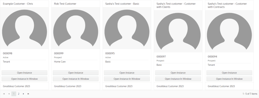
Example of the Basic card layout:
Example of the Advanced card layout:

Where Do We Get the Data for This Control?
Contains the target information of the target that will be called to get the card data.
Enable Data Auto Refreshing
Determines if the card data will refresh automatically after a specified period of time. It’s recommended to enable this if the data is frequently updated.
Every How Many Minutes Should the Data Refresh?
Only applicable when “Enable Data Auto Refreshing” is set to “Yes”.
Specifies the interval in minutes for automatically refreshing the card data.
Add Search Component?
This is an advanced feature and requires custom TSQL. Search Components are only applicable when Custom Data is selected. If a search component is defined, a TSQL procedure must also be selected.
The search component will appear at the top of the Field, and the user will be able to use it to filter the data.
Type
Determines if the Basic or Advanced layout will be used for the cards.
Orientation
Determines the orientation of the cards.
Width (px)
Determines the width in pixels of the cards. Set this to 0 for cards to automatically size to the content to its smallest form.
Page Size
Determines how many cards will be displayed per page. If there are more cards than the page size, they will be paginated to allow navigation between pages.

Enable Body Divider
Only applicable when “Type” is set to “Basic”.
Determines if there will be a divider between the body and body titles on the card.

Card Keys
Only applicable when “Type” is set to “Advanced”.
Specifies the names of the columns in the target that contains the value that will be inserted into the HTML. Names are case sensitive and should be separated by a comma with no spaces (for example: KeyOne,KeyTwo,KeyThree).
Card HTML
Only applicable when “Type” is set to “Advanced”.
Contains the custom HTML that will be applied to each card. If inserting data into the HTML from TSQL, ensure that the Keys are correctly identified in the HTML (for example: {CardKey}).
Add Delete Button
Determines if the delete button will be displayed. The delete button deletes the card and the record, and is only displayed if the user has access to delete the record.

Add Open Button
Determines if the button to open the instance will be displayed.
If the Card Field is on a wizard, the Open button will be suppressed, and the Open In Window button will be displayed instead.

Add Open In Window Button
Determines if the button to open the instance in a popup window will be displayed.

Display Action Buttons
Determines if the available commands/events/wizards for that instance will be displayed on the card. Selecting one of the buttons will execute the command/event/wizard.
If this is set to Yes, it’s highly recommended to return the InstanceStatus of the instance in the target so the component correctly refreshes.
Suppress Commands/Events/Wizards
Only applicable when “Display Action Buttons” is set to “Yes”.
Contains the actions that will be suppressed and will not be displayed on the card if Action Buttons are enabled.
Load Card Actions Manually
Determines if a button to load the card actions will be displayed on the cards instead of loading all the card actions automatically. If set to “Yes”, this will significantly improve performance of cards by reducing the initial load time of the cards.

Load Card Actions Button Icon
Only applicable when “Load Card Actions Manually” is set to “Yes”.
Should the default options button icon be overridden by a different icon? If so, the icon can be specified here using CSS classes.
For example, if using FontAwesome’s light envelope icon, fa-light fa-envelope would be entered in this Field.

Load Card Actions Button Text
Only applicable when “Load Card Actions Manually” is set to “Yes”.
Overrides the text on the options button. This should be a short phrase that clearly states what will happen when the user clicks the button.

Custom Instance Window Title
Determines if a custom title will be applied to the instance window if the card is opened in a popup window.

Instance Window Title
Only applicable when “Custom Instance Window Title” is set to “Yes”.
Contains the title that will be displayed when the card is opened in a popup window.